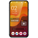
Validate the system, not a single artboard
Check spacing, type scale, and component behavior across real viewport widths before the build drifts.
- Side-by-side breakpoint proof
- Client-ready device frames
- Catch clip & overflow early
MSIM Mobile Simulator
Side-by-side device previews with sync scroll — so designers, PMs, and testers catch responsive bugs before users do.
Built for the people who own the UI story — not just the CSS.
Product demo
A real walkthrough of multi-device preview, sync scroll, and the daily responsive workflow.
Social proof
Chrome Web Store metrics. Free core product — no account required.

“I stop guessing breakpoints. Open three devices, sync scroll once, and the overflow is obvious before handoff.”
“Great for PR and stakeholder checks: phone + tablet + wide phone on the real staging URL, no deck of screenshots.”
“QA passes go faster when frames look like real devices and sync scroll keeps every viewport aligned.”
Who it’s for
MSIM sits between Figma and production — where layout truth gets verified.
Check spacing, type scale, and component behavior across real viewport widths before the build drifts.
Review flows on phone and tablet without waiting for a screenshot pack or a DevTools walkthrough.
Run checklist items across presets in one view — sync scroll makes layout diffs jump out.
Stop hopping one viewport at a time.
Browser support
Install Mobile Simulator from the official Chrome Web Store or Firefox Add-ons. Same multi-device preview workflow in the browser you already use.
Install from the Chrome Web Store. Works on Chromium-based browsers that support Chrome extensions.
Get it for ChromeInstall from Firefox Add-ons. Built for the same responsive QA workflow inside Firefox.
Get it for FirefoxFeatures overview
Built for design reviews, PM walkthroughs, and QA checklists — fewer DevTools switches, clearer multi-device overview.
Open iPhone, Android, and tablet sizes side by side — no dragging the browser window around.
Scroll once, watch every device move together so layout bugs jump out immediately.
Toggle realistic frames for stakeholder-ready previews, or turn them off for pure layout work.
Add any width and height when presets are not enough for your breakpoint system.
Jump into mobile-only, tablet-only, popular 3-pack, or iOS/Android sets in one click.
Flip orientation and reload all views from the toolbar while you iterate on the UI.
Differentiation
MSIM is not a cloud device farm. It previews the page you already opened — local, staging, and logged-in sessions stay in context.
Open localhost or staging in Chrome, launch MSIM, and compare devices without uploading a build to a remote lab.
If you are already signed in on the tab, the simulator runs on that same session. No separate login sandbox required for basic preview.
Side-by-side phones and tablets with optional frames beat resizing one DevTools viewport over and over.
Some sites block embedding with security headers. MSIM surfaces that clearly. We optimize for real developer tabs, not unlimited fake iframes.
Many generic responsive viewers struggle with localhost, staging, authenticated apps, and iframe restrictions. MSIM focuses on the browser-tab workflows design, product, and QA teams already use.
Why not only Chrome DevTools?
Keep DevTools for DOM inspection. Use MSIM when you need speed and visual comparison across breakpoints.
| Chrome DevTools | MSIM |
|---|---|
| One device at a time | Multiple devices side-by-side |
| Manual switching between sizes | Immediate comparison board |
| Slower visual overview | Faster validation with sync scroll |
| Great for DOM debugging | Great for design QA, PM reviews & layout passes |
How it works
Install once. Use it on any tab. No account, no config files.
Install from the Chrome Web Store or Firefox Add-ons in seconds. Lightweight permissions only.
Click the extension, pick devices from the library, hit Open Selected.
Use sync scroll, rotate, and multi-device view to catch layout issues before clients do.
Use cases
From design handoff to release checklist — multi-device proof without the ceremony.
Check layouts across devices before you open a PR or tag a release.
Read use case →Catch breakpoint issues quickly without reconfiguring DevTools for every size.
Read use case →Validate client sites across devices and share clearer visual checks with stakeholders.
Read use case →Verify mobile shopping layouts, product grids, and checkout breakpoints faster.
Read use case →FAQ
Yes. The core multi-device simulator is free forever. No account required for basic use.
DevTools is great for one viewport. Mobile Simulator is built for comparing multiple real device sizes at once with frames, sync scroll, and quick presets.
No. We polish devices and quality, but keep the same Devices / Settings / Quick Actions flow so existing users do not relearn anything.
Some websites block embedding with security headers. When that happens, the tool shows a clear message. We keep improving reliability without bloating permissions.
No display ad networks inside your pages. The core simulator stays free. We may later show optional, disclosed partner tool suggestions. None are live on this site yet.
Mobile Simulator is available for Google Chrome and Mozilla Firefox.
Email support@msim.app, use the contact page, or the support link on the Chrome Web Store / Firefox Add-ons listing.
Multi-device responsive checks for designers, PMs, and testers — in Chrome or Firefox.